So, I had input from a few of you about materials :) I've mentioned in Part One under comments about the availability of material... if you have questions at any step, I'd be most obliged to happily assist you with them :)
Here is the continuation of our first class...
Just to recap, we've gone over material. We've gone over embellishments, I've also spoken about why I chose what I did with a few tips and pointers on how to pick out your embellishments.
Selecting our Isle
You may have noticed in my projects, there's a focal point. I'll refer to it as the isle. It's the area within the layout that is dense with layering or embellishment and holds your primary focus. It grasps your eye, be it because of something extraordinary placed there, or because it's just the area on the layout that has something to draw your focus to.
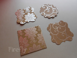
Here's how we select our isle. You may note, that I pulled out one base, and 2 printed papers.
The reason for two, is to see which one may work better with your base.
What you need to do with your patterned paper. Take an area that interests you. Cut out a small square window to see what you like better, like a view finder so to speak. The area that I felt was interesting, I cut and cropped it out in different shapes.
You can do a rectangle, a circle, a scallop, flourishes, a square... a flower. Anything. :) You're going to build upon this.


Here is the continuation of our first class...
Just to recap, we've gone over material. We've gone over embellishments, I've also spoken about why I chose what I did with a few tips and pointers on how to pick out your embellishments.
Selecting our Isle
You may have noticed in my projects, there's a focal point. I'll refer to it as the isle. It's the area within the layout that is dense with layering or embellishment and holds your primary focus. It grasps your eye, be it because of something extraordinary placed there, or because it's just the area on the layout that has something to draw your focus to.
Here's how we select our isle. You may note, that I pulled out one base, and 2 printed papers.
The reason for two, is to see which one may work better with your base.
What you need to do with your patterned paper. Take an area that interests you. Cut out a small square window to see what you like better, like a view finder so to speak. The area that I felt was interesting, I cut and cropped it out in different shapes.
You can do a rectangle, a circle, a scallop, flourishes, a square... a flower. Anything. :) You're going to build upon this.

I took out two shapes with each pattern, just to have variety to choose from.
Though the patterns are the same, the different shapes make a great impact on how they appear to the eye. Do you see the difference?
Next, think of where you want your isle.. is it the center of the page? Do you want it on a corner, it could be anywhere... for starters, let's stay away from symmetry :) Also... placing things 3/4th or 1/4th the way make an interesting composition.
I decided, I want mine, not in the center, but between the center and top.. toward the right. So I began placing my isle basis, to see which I liked better. :)


The shapes and pattern do have an overall impact. I selected the heavily patterned flourish for my layout, simply because it didn't merge with the nude/beige base I was working with. The swirls blend in and don't hold attention as much as the flourish does. If I were to go with the square, I'd give it a black border, just to define it a little :)

Adding our Florals...
Once I had my isle in place, I took out the flowers. Please note, you are not going to stick any thing til the very end, you're going to move things around a million times to get the look you want :)

I like starting with my largest flower, and layering it with a smaller one. Here I began with my neutral one.

Played around and placed the next one.

then the other. If you remember, in part one, I mentioned why I have one black flower instead of two. The black is stark and stands out. This way your eye goes to one place, instead of hopping between two :)

Creating a little interest there.

I didn't like the green leaves, I pulled them off. I do that a LOT with my rosettes :P

seeing if this works...

That about does it, we can introduce our mesh. You can either lay it flat under your flowers like a strip or band..

OR you can fold it over and make it like a little ribbon...
OUR button...

Add in your little button :)
5 Metal finds...
So you're wondering, how are we using all five of our metal finds? Here's the fun part :D
We're not. We are using only ONE of them, but we will see how each of the five looks before we decide on finalizing our layout. :)

I felt the little key could have a little home there in the flower...

Tried the button, it wasn't really going so much...

That kinda looks cute :)

The Tim Holtz pin just doesn't cut it...

That just might work.. simple yet present :)
Next Post..
Bands, Boxes.. and our final look :)
No comments:
Post a Comment